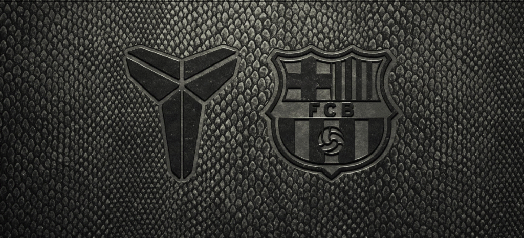
Bitesize Brand

Creative Inspiration

Image Credit: Macallen

The Macallan Reimagined

The Macallan updates its iconic collections with a sleek new visual identity. Collaborating with designer David Carson, the brand introduces refreshed bottle shapes, labels, and packaging that honor its heritage while feeling modern. Inspiration comes from the distillery’s architecture and the Sherry Triangle, blending tradition with contemporary style. Key Highlights: Balancing tradition with innovation strengthens

The Macallan Reimagined Read More »

Image credit: Pantone

Pantone’s Peach Fuzz

Pantone’s unveiling of 13-1023 Peach Fuzz as the 2024 colour of the year signals a unique blend of warmth and modern elegance, fostering a connection between the timeless and the contemporary. Described as a velvety peach tone, Peach Fuzz symbolizes closeness, empathy, and moments of quietude. Recommended for packaging, multimedia, interior design, and beauty, it

Pantone’s Peach Fuzz Read More »

Image credit: NHM

NHM: A Leap into Dynamic Relevance

The transformation Natural History Museum’s (NHM) identity offers an insightful lesson in rejuvenating a heritage institution. The rebrand strategically aligns the museum as an ‘active catalyst’, encouraging visitor advocacy for the planet. The logo, a fluid circular symbol, underscores interconnectedness in nature, while the colour scheme—primarily lime yellow and brown—mirrors the diverse natural elements housed

NHM: A Leap into Dynamic Relevance Read More »

Image credit: BBC Nordic

BBC Nordic Identity Inspired by Light Refraction

BBC Nordic has created a new brand identity, drawing inspiration from the way light refracts through a prism. Using insights from the channel’s Scandinavian audience, design studio Weareseventeen developed the brand idea “The Bright Side” with three brand principles: “Warm Connections,” “Illuminating Moments,” and “Cultivating Contrasts.”. The core asset for the brand is a diagonal

BBC Nordic Identity Inspired by Light Refraction Read More »

Image credit: Fanta

Fanta gets a Refresh

Fanta, owned by Coca-Cola, has revealed its first-ever global brand identity with a fresh design system aimed at bringing consistency to its packaging worldwide. The custom typeface adds unique wonky angles and proportions, giving Fanta a distinct and memorable typographic style. The expanded colour palette allows for greater versatility in showcasing the various flavours of

Fanta gets a Refresh Read More »

Scroll to Top