Wise Rebrands for Accessibility
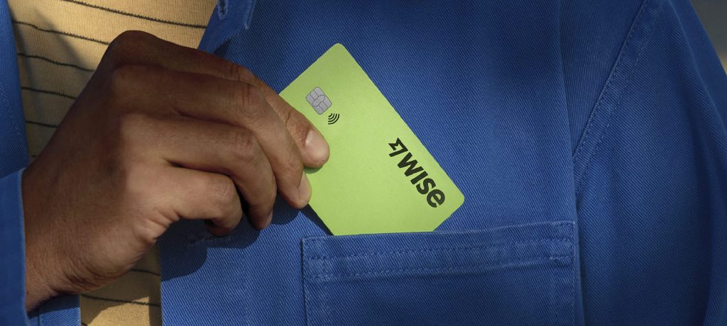
FinTech Company Wise has rebranded to focus on accessibility and global resonance, collaborating with Ragged Edge to create a new green colour palette, bespoke typeface, and “graphic tapestries” for a cohesive brand identity. The motion principles were designed to be fluid across products and communications, and every design decision exceeded accessibility standards. The emphasis on […]
Wise Rebrands for Accessibility Read More »