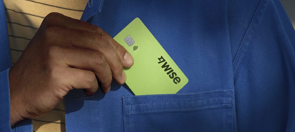
FinTech Company Wise has rebranded to focus on accessibility and global resonance, collaborating with Ragged Edge to create a new green colour palette, bespoke typeface, and “graphic tapestries” for a cohesive brand identity. The motion principles were designed to be fluid across products and communications, and every design decision exceeded accessibility standards. The emphasis on accessibility and inclusivity showcases the importance of designing for all users, inspiring other brands to create more inclusive experiences.
Wise’s rebranding aligns with its mission to challenge the financial status quo and promote inclusivity. The design decisions prioritize inclusivity, resulting in a design system that supports 146+ languages and exceeds WCAG 3.0 requirements, making it one of the most accessible in the world. This advantage could help them stand out among competitors