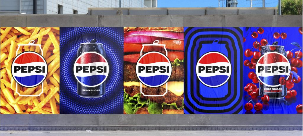
Pepsi has revealed a new logo and visual identity, the first update to the logo in 14 years. The refreshed design borrows equity from the brand’s 125-year history, including the logo from the 1970s to 1990s, and features more “movement and animation” to appeal in an “increasingly digital world.” The new visual identity will be rolled out in North America in autumn this year and globally next year. The refresh also introduces the colour black from the branding of Pepsi Zero Sugar, highlighting Pepsi’s “continued focus” on its zero sugar offering.
The success of Pepsi’s rebranding strategy, which balances heritage with modernity, remains to be seen, as it raises the question of whether the appeal of the familiar will be outweighed by the need to stay relevant. Only time will tell if this update resonates with consumers and effectively maintains Pepsi’s position in popular culture.