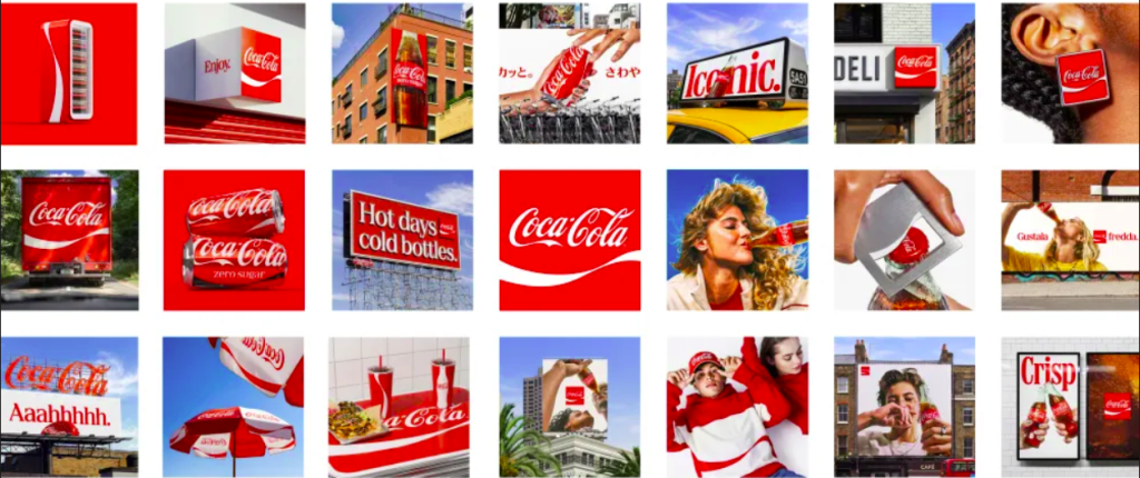
Bitesize Brand

Creative Inspiration

The logo that didn’t need a name

During the 2026 FIFA World Cup, matches held at Levi’s Stadium in Santa Clara, California triggered the governing body’s clean stadium policy — which requires all non-sponsor branding to be removed or covered before kick-off. The Levi’s name was hidden. The batwing logo remained visible. Levi’s issued a press release stating that fans recognised the […]

The logo that didn’t need a name Read More »

Walmart Reveals Refresh

Walmart quietly dropped one of the most revealing pieces of brand research of the year. Customers liked the quality of Great Value products. They liked the price. But they “didn’t particularly feel very proud to display it in their home or with their families.” That admission, from Walmart’s own VP of Creative, David Hartman, explains

Walmart Reveals Refresh Read More »

Image Credit: Macallen

The Macallan Reimagined

The Macallan updates its iconic collections with a sleek new visual identity. Collaborating with designer David Carson, the brand introduces refreshed bottle shapes, labels, and packaging that honor its heritage while feeling modern. Inspiration comes from the distillery’s architecture and the Sherry Triangle, blending tradition with contemporary style. Key Highlights: Balancing tradition with innovation strengthens

The Macallan Reimagined Read More »

Image credit: Pantone

Pantone’s Peach Fuzz

Pantone’s unveiling of 13-1023 Peach Fuzz as the 2024 colour of the year signals a unique blend of warmth and modern elegance, fostering a connection between the timeless and the contemporary. Described as a velvety peach tone, Peach Fuzz symbolizes closeness, empathy, and moments of quietude. Recommended for packaging, multimedia, interior design, and beauty, it

Pantone’s Peach Fuzz Read More »

Image credit: NHM

NHM: A Leap into Dynamic Relevance

The transformation Natural History Museum’s (NHM) identity offers an insightful lesson in rejuvenating a heritage institution. The rebrand strategically aligns the museum as an ‘active catalyst’, encouraging visitor advocacy for the planet. The logo, a fluid circular symbol, underscores interconnectedness in nature, while the colour scheme—primarily lime yellow and brown—mirrors the diverse natural elements housed

NHM: A Leap into Dynamic Relevance Read More »

Image credit: BBC Nordic

BBC Nordic Identity Inspired by Light Refraction

BBC Nordic has created a new brand identity, drawing inspiration from the way light refracts through a prism. Using insights from the channel’s Scandinavian audience, design studio Weareseventeen developed the brand idea “The Bright Side” with three brand principles: “Warm Connections,” “Illuminating Moments,” and “Cultivating Contrasts.”. The core asset for the brand is a diagonal

BBC Nordic Identity Inspired by Light Refraction Read More »

Scroll to Top