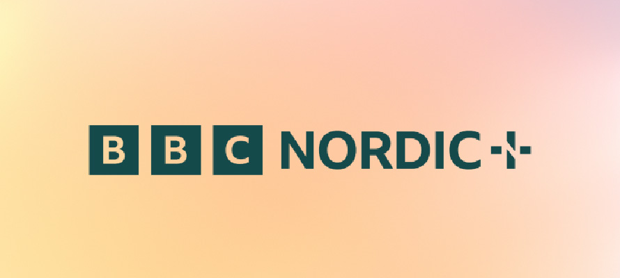
BBC Nordic has created a new brand identity, drawing inspiration from the way light refracts through a prism. Using insights from the channel’s Scandinavian audience, design studio Weareseventeen developed the brand idea “The Bright Side” with three brand principles: “Warm Connections,” “Illuminating Moments,” and “Cultivating Contrasts.”.
The core asset for the brand is a diagonal stroke, which references the central line in the letter N and acts as an “angular Prism Edge” that radiates and transforms light in motion graphics
The brand’s primary palette includes warm and cool tones, and the logo appears in green as a nod to Nordic landscapes and muted tones in Scandinavian design.
The strict guidelines from the BBC pushed the design team to develop an identity that is compatible with the master brand while also being unique, contemporary, and catering to a Nordic audience’s taste and needs.