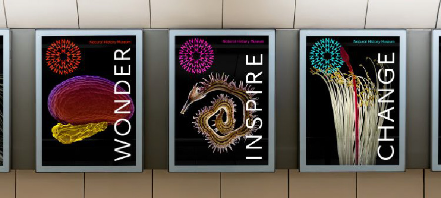
The transformation Natural History Museum’s (NHM) identity offers an insightful lesson in rejuvenating a heritage institution. The rebrand strategically aligns the museum as an ‘active catalyst’, encouraging visitor advocacy for the planet. The logo, a fluid circular symbol, underscores interconnectedness in nature, while the colour scheme—primarily lime yellow and brown—mirrors the diverse natural elements housed within the museum.
The fluid, circular logo invites diverse interpretations and fosters deeper engagement with the museum’s underlying themes.
The new brand identity adeptly utilizes color and typography to enhance aesthetic appeal, maintain historical connections, and improve accessibility for visitors.
The rebrand of the Natural History Museum underscores the significance of using dynamic, symbolic design to mirror an evolving mission, while emphasizing accessibility and audience engagement.