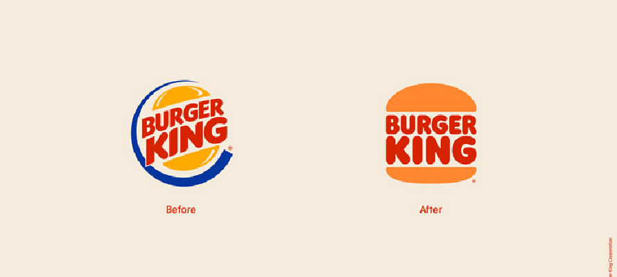
Burger King is undertaking its first comprehensive rebrand in 20 years, aiming to better echo the brand’s core values. Central elements of this transformation include:
The debut of a redrawn logo, which harks back to the brand’s visual past, abandoning the stylized 1999 logo for a more “timeless” look.
The introduction of a unique, bold serif typeface named ‘Flame,’ designed to reflect the restaurant’s ’rounded, bold, yummy’ food.
A colour palette drawn from the brand’s iconic flame-grilling process, named ‘Fiery Red,’ ‘Flaming Orange,’ and ‘Barbecue Brown.’
Delving into a brand’s history and ethos can help craft a timeless, authentic identity, while driving resonance with the brand’s distinct offerings. This approach ensures the rebrand will not only mirror the brand’s essence but also endure future shifts in trends and consumer preferences.