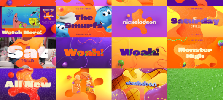
Nickelodeon has breathed fresh life into its brand after 14 years, emphasizing the value of preserving brand legacy while ensuring modern relevance. The children’s television channel worked closely with design agency Roger to create a unifying, dynamic identity that would shine across all platforms.
A refreshed ‘Splat’ logo based on a circular grid system introduces a seamless design language, underscoring the role of a versatile and recognizable symbol in brand identity.
An expanded colour palette keeps Nickelodeon’s iconic orange, yet explores new hues, demonstrating how brands can maintain familiarity while embracing novelty.
This rebrand embraces change through a modernized logo design, a fresh colour palette, and a modular system that allows for future adaptability. It underscores the importance of flexibility and adaptability in a brand’s future strategic evolution.