Bitesize Brand

Julianna

Image credit: Pantone

Pantone’s Peach Fuzz

Pantone’s unveiling of 13-1023 Peach Fuzz as the 2024 colour of the year signals a unique blend of warmth and modern elegance, fostering a connection between the timeless and the contemporary. Described as a velvety peach tone, Peach Fuzz symbolizes closeness, empathy, and moments of quietude. Recommended for packaging, multimedia, interior design, and beauty, it […]

Pantone’s Peach Fuzz Read More »
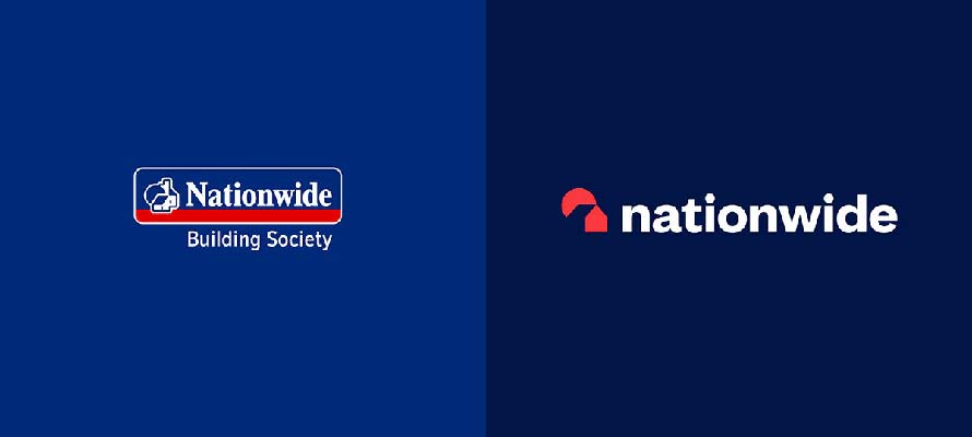
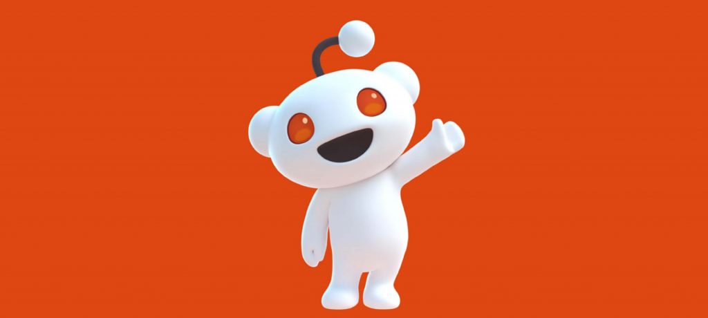
Image Credit: Reddit

Reddit’s 3D Revamp

The overhaul of Reddit’s brand identity marks a comprehensive shift, incorporating a new font family, Reddit Sans, while introducing a transformed 3D Snoo to amplify the platform’s global presence. Reddit’s visual identity sees a new font, Reddit Sans, and a transformed 3D Snoo character, streamlining brand elements. The refresh maintains Reddit’s genuine community spirit while

Reddit’s 3D Revamp Read More »

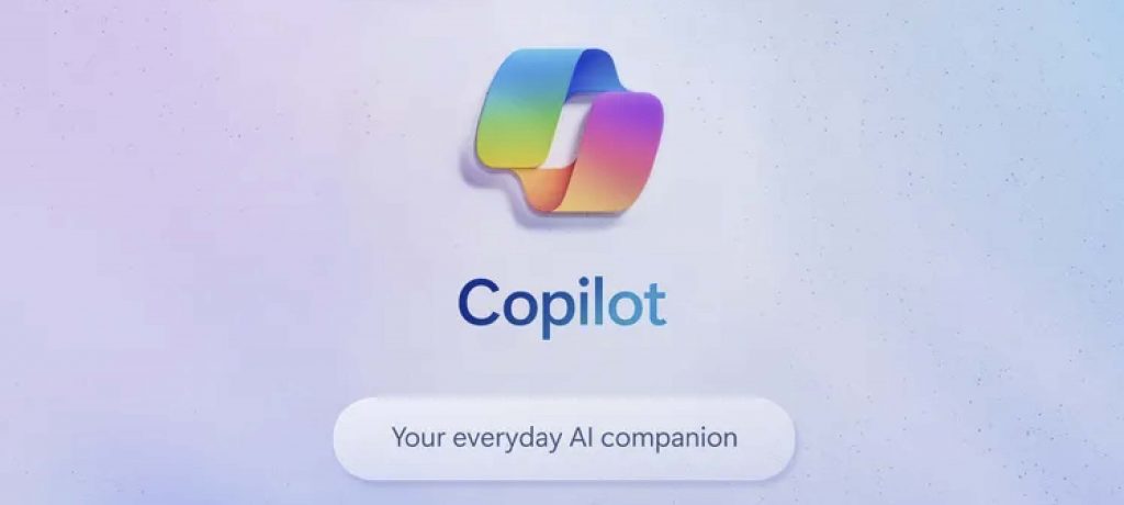
Image Credit: Microsoft

Microsoft renames Bing Chat to Copilot

Microsoft renamed its AI chatbot from Bing Chat to Copilot, competing directly with ChatGPT, attempting to reposition the AI assistant landscape. Bing Chat evolves into Copilot, aiming to challenge ChatGPT’s dominance in the AI chatbot sphere, following OpenAI’s revelation of 100 million weekly ChatGPT users. Microsoft positions Copilot as a competitive choice for both consumers

Microsoft renames Bing Chat to Copilot Read More »

Image Credit: Borussia Dortmund

Borussia Dortmund’s Brand Transformation

Borussia Dortmund, the renowned German football club, has boldly revamped its brand, marrying tradition and innovation, weaving a rich history with contemporary aesthetics. New Strategy: The slogan ‘Together we go all in’ unites BVB’s passion and commercial success, acknowledging their shift from underdogs to challengers. The ‘Yellow Wall,’ a massive fan stand at Signal Iduna

Borussia Dortmund’s Brand Transformation Read More »

Image credit: Nationwide

Nationwide’s Rebrand: A Modern Facelift

Nationwide unveils its most significant rebrand in 30 years. This revamp is not just a cosmetic change; it underscores Nationwide’s status as a “member-owned” institution in contrast to shareholder-owned banks. Key elements: Nationwide’s logo gets a contemporary touch, simplifying its house icon and adopting a lowercase ‘n’. A shift to Editorial New typography combines nostalgia

Nationwide’s Rebrand: A Modern Facelift Read More »

Scroll to Top