Bitesize Brand

Julianna

Image Credit: Macallen

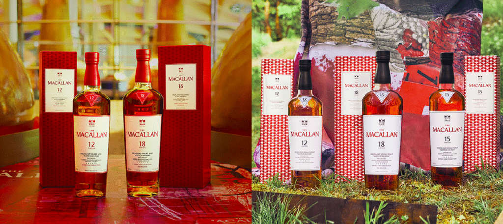
The Macallan Reimagined

The Macallan updates its iconic collections with a sleek new visual identity. Collaborating with designer David Carson, the brand introduces refreshed bottle shapes, labels, and packaging that honor its heritage while feeling modern. Inspiration comes from the distillery’s architecture and the Sherry Triangle, blending tradition with contemporary style. Key Highlights: Balancing tradition with innovation strengthens […]

The Macallan Reimagined Read More »

Stone-Cold Clarity

In an industry often bogged down by acronyms and risk-aversion, Stein’s rebrand offers a sharp lesson in strategic clarity. Dropping the “IAS” from its name, the 52-year-old agency signals a return to its roots—with a nod to strength (“Stein” means “rock” in German)—while stepping confidently into a future defined by creativity and brand leadership in

Stone-Cold Clarity Read More »

PwC’s Pivot to Momentum

PwC’s first brand refresh in 14 years comes not with a bang, but with a calculated push—a shift built around the concept of “momentum.” Rather than reinventing its image wholesale, the firm leans into subtle evolution: a slightly sleeker logo, a campaign-friendly slogan (“So You Can”), and a repositioning of itself not as a service

PwC’s Pivot to Momentum Read More »

Unified by Design

Hitachi’s first visual revamp in 25 years is more than cosmetic—it’s a strategic move to unify its vast global businesses under the banner of “True One Hitachi.” With an evolved wordmark, dynamic graphics, and a custom typeface, the brand signals a future-focused shift while staying rooted in its legacy. This redesign isn’t about chasing trends—it’s

Unified by Design Read More »

Corporate Appetite, Eternal Ambition

Zomato’s quiet transformation into Eternal Ltd may not rattle its food delivery users, but for industry watchers, it’s a textbook corporate maturation. By separating its corporate identity from its flagship brand, Zomato follows the well-worn path of Alphabet and Meta—clearing the way for strategic expansion into new sectors without diluting brand equity. While the consumer-facing

Corporate Appetite, Eternal Ambition Read More »

Grow to Know: A Blueprint for Growth

Grow to Know, a community-driven environmental non-profit, has unveiled a striking new identity crafted by Pentagram’s Marina Willer. At its core is cyanotype imagery, an early photographic technique that creates rich blue silhouettes of natural elements. This choice is more than aesthetic—it symbolizes the organization’s mission to nurture growth, transformation, and deep community roots. The

Grow to Know: A Blueprint for Growth Read More »

Mozilla’s Rebrand: Can Nostalgia Rebuild Trust?

Mozilla’s 2024 rebrand ditches the corporate look for a bold, retro-inspired design featuring bright RGB green and a playful typeface. This shift taps into early internet nostalgia, reinforcing Mozilla’s identity as a champion of an open, user-first web. The move is more than aesthetic—it’s strategic. In a tech landscape dominated by sleek, corporate branding, Mozilla

Mozilla’s Rebrand: Can Nostalgia Rebuild Trust? Read More »

Image Credit: HemoCue

HemoCue Rebrands as ‘The Caring Expert’

HemoCue, a global healthcare company under Danaher Corporation, has rebranded with a new identity developed by Designit, positioning itself as “The Caring Expert.” This shift marks its evolution from a product-based focus to a global healthcare solutions provider. The new branding, unveiled at the 2024 European Emergency Medicine Congress, emphasizes simplicity and care, with an

HemoCue Rebrands as ‘The Caring Expert’ Read More »

Scroll to Top