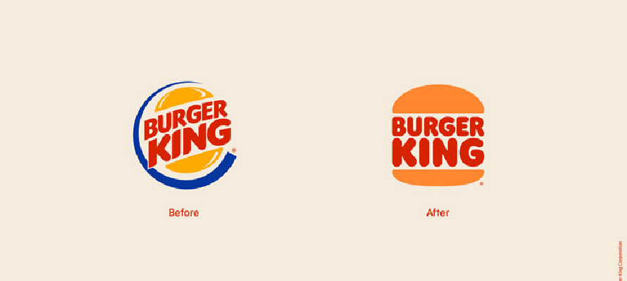
Jaguar’s latest rebrand signals a dramatic shift as it moves toward an all-electric future. With the slogan “Copy Nothing,” the brand leans into originality, honoring its heritage while embracing modernity. The most striking change is the new “JaGUar” logo, a geometric, minimalist design meant to evoke balance and innovation. Meanwhile, the iconic leaping cat has been reimagined as a “maker’s mark,” embossed in brass to convey craftsmanship and exclusivity.
Reactions are mixed. Some see it as a fresh, necessary evolution, positioning Jaguar as a premium electric competitor. Others worry it strays too far from the brand’s classic identity, risking alienation of loyal fans.
The lesson? Rebrands should evolve a brand’s story, not erase it. Reinvention is crucial, but balance is key—stray too far, and you risk losing what made you iconic in the first place.