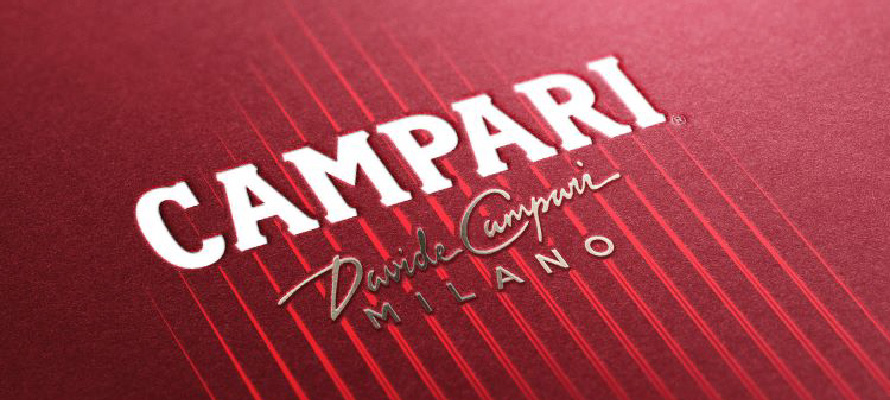
Italian aperitivo brand Campari’s recent rebrand effectively marries tradition with modernity. Echoing Milanese architecture, the new canneté bottle design bolsters the brand’s distinctive allure and enhances shelf presence. The downsized label, featuring the founder’s signature, spotlights Campari’s unique red colour, underlining craftsmanship and authority. To keep the brand fresh and cosmopolitan, the colour palette incorporates an elegant blue and a cooler mix of gold and silver.
This transformation underscores an important point that any successful rebranding requires a delicate balance of respecting history, embracing locality, and spotlighting unique brand features, creating a future-ready identity that resonates with its audience.