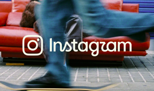
Instagram unveiled its first major brand refresh in over ten years, the most interesting part of the story is how close they came to scrapping the script wordmark entirely. Creative director Christy Silva and director of brand design Cynthia Pratomo explored hundreds of directions, including non-script logos, before concluding the results made the brand unrecognisable. “Every time we stripped out the script, we became unrecognisable to ourselves. Walking away from it entirely felt like walking away from the unique qualities of who we are,” said Pratomo. The script stays, now refined, not replaced.
The wordmark keeps its cursive but is bolder, with serifs flattened and detached. A new viewfinder device, derived from the camera glyph, frames imagery throughout the system and draws attention back to the act of taking the picture. The sunset gradient steps back — appearing now as a light leak referencing photographic history rather than a flat digital motif. A new custom handwriting typeface, Instagram Pen, is in development: a “warm, collective signature” built from testing soft pencils and bold ink pens across different writing styles. The whole system is designed, as Pratomo put it, to get out of the way: “Our storytelling focuses on the creators and content we’re celebrating, rather than us.”
- The team deliberately pushed back against corporate sans-serif “blanding” — retaining the script was a statement about commitment to real, unfiltered expression
- Tactile visual cues throughout — contact sheets, registration marks, annotations — reference photographic history rather than borrowed analogue aesthetics
- Instagram Pen joins a series of artist collaboration typefaces, including custom fonts developed with Rosalía and Olivia Rodrigo
- Rollout is global, continuing through 2026 — UI, motion, and layout updates follow the wordmark
Instagram had the clout to do almost anything and chose to do less. The viewfinder pulls focus back to creators. The gradient steps back. The system gets out of the way. That’s a coherent philosophy built into the design decisions, not just a style choice. The hardest brief in branding isn’t “make it new.” It’s “make it better without anyone quite knowing why.”