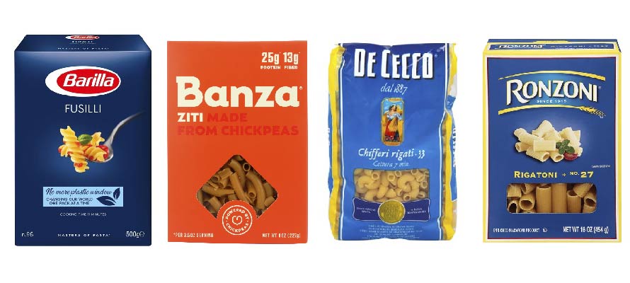
Banza is a US food start-up, which uses chickpea as the primary ingredient for its pasta and rice products. When it first launched in 2014, its packaging came in a creamy white box with red-to-yellow gradient brushstrokes.
Seeking a better way to distinguish itself, in 2016, the company began rolling out a bright orange box to better contrast with the more traditional pasta brands—Barilla, Ronzoni, De Cecco—which tend to come in blue boxes.
Because orange and blue occupy opposite sides of the colour wheel, orange really pops out when juxtaposed with blue, and within a year of introducing the new packaging, interest in the brand has only increased.
Colour appears to be most important cue in grabbing someone’s attention, and it is no secret that brands use it as a prompt to stick out from the crowd. Consistent use of brand colour, enables successful brands to strengthen their association with that particular colour which in turn increases awareness as a whole.