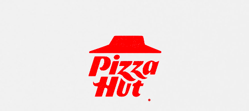
Pizza Hut’s global refresh takes a measured approach. The iconic red roof remains the core asset, but the logo has been cleaned up: the roof mark is now slightly flatter and more graphic, the wordmark is set in a more contemporary, slanted script, and the red-and-white palette is standardised more consistently across packaging, storefronts, and digital use. The update isn’t loud — it’s closer to tightening the screws than rebuilding the structure — but the result feels more cohesive across regions.
Strategically, this matters because the red roof already carries enormous recognition value; the brand is leaning into that nostalgic equity rather than discarding it. Meanwhile, the tighter global visual system still leaves space for each market to create culturally specific campaigns and partnerships, keeping the brand relevant on the ground.
When a brand’s strongest asset is memory and emotional recognition, the smartest move often isn’t reinvention — it’s refinement, applied with discipline.