Revitalizing Tradition: Lamborghini’s Iconic Rebrand
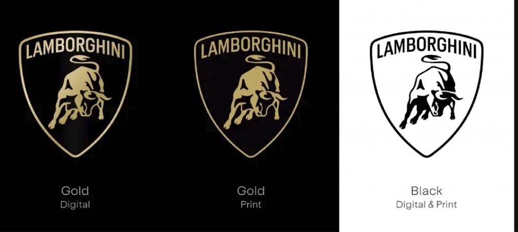
Luxury automotive powerhouse Automobili Lamborghini unveils a striking new logo and visual identity, marking a significant departure from its iconic emblem of the past two decades. Here’s what sets this rebrand apart: This case underscores the importance of balancing tradition with innovation, as Lamborghini embarks on a new chapter defined by sustainability and visionary leadership. …
Revitalizing Tradition: Lamborghini’s Iconic Rebrand Read More »