Luxury automotive powerhouse Automobili Lamborghini unveils a striking new logo and visual identity, marking a significant departure from its iconic emblem of the past two decades. Here’s what sets this rebrand apart:
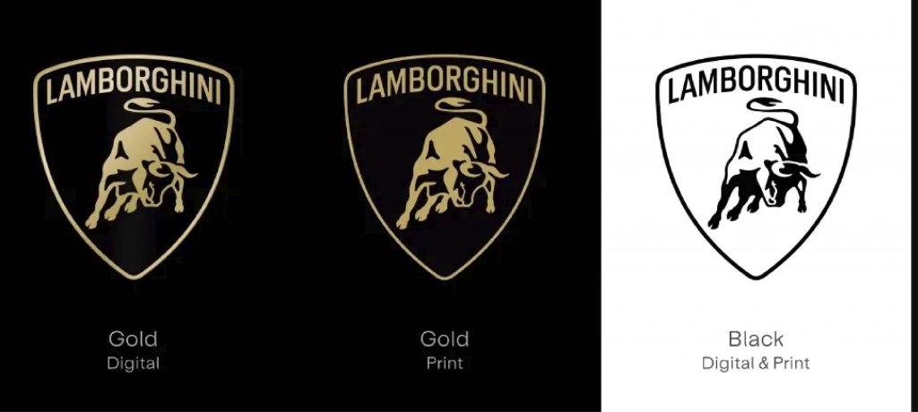
- Bold Aesthetic Evolution: Lamborghini’s revamped logo features a broader typeface and introduces gold as an accent color, infusing the brand with renewed energy while maintaining its signature black and white hues. The iconic bull emblem, previously integrated into the shield, now stands alone on digital platforms, symbolizing the brand’s enduring strength and independence.
- Unified Brand Expression: In line with its new strategy, “Direzione Cor Tauri,” Lamborghini’s rebrand extends beyond the logo to encompass a cohesive visual language, including a bespoke typeface and a set of icons developed in collaboration with Lamborghini Centro Stile. This unified approach ensures consistency across all touchpoints, reinforcing the brand’s commitment to authenticity and innovation.
- Sustainable Vision: Embracing sustainability and decarbonization, Lamborghini’s rebrand reflects a forward-thinking ethos aimed at inspiring and leading the automotive industry toward a greener future. With a roadmap to electrification and a pledge for total carbon neutrality by 2050, the company sets a bold example for environmental stewardship and responsible innovation.
This case underscores the importance of balancing tradition with innovation, as Lamborghini embarks on a new chapter defined by sustainability and visionary leadership. By redefining its visual identity and embracing a sustainable vision, the brand not only reaffirms its status as a luxury icon but also positions itself as a catalyst for positive change in the automotive landscape.