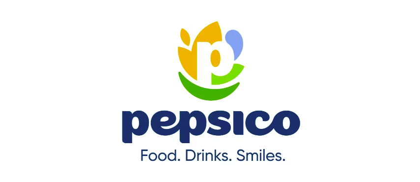
PepsiCo has introduced a new corporate identity designed to bring greater cohesion across its expansive portfolio. Visually, the change includes a simplified globe emblem with cleaner lines, a more geometric custom typeface, and a fresher blue-and-white palette that scales more fluidly across digital environments. The wordmark and symbol now feel more unified, with less of the layered shading and curvature that dated the previous look. The system is intentionally modular, allowing the corporate brand to sit more clearly above consumer-facing brands without overshadowing them.
Strategically, the refresh is less about spectacle and more about alignment, tightening how PepsiCo presents itself as one company rather than a loose federation of sub-brands.
For large organisations, identity work isn’t just aesthetic; it’s an exercise in clarity. When your portfolio grows, your brand story has to sharpen, not expand.