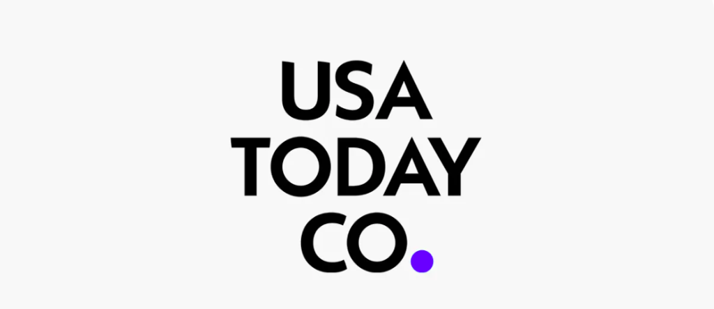
Gannett Co., Inc. announced that it will officially rebrand itself as USA TODAY Co., effective November 18, adopting the name of its most recognised national masthead.
Key elements of the change include:
- A corporate name change (from Gannett Co., Inc. to USA TODAY Co., Inc.) and a new stock ticker symbol “TDAY” on the NYSE.
- A refreshed visual identity: the new logo draws on the well-known “blue point” icon of the USA TODAY brand, paired with a combination of typefaces — Adobe Caslon Pro (a classic serif) and Futura PT (a modern sans) — to reflect a bridge between tradition and a digital-first future.
- A strategic positioning shift: the company emphasises its role as a “trusted digital platform” connecting audiences nationwide, not just as a legacy print publisher. The refresh leverages the heritage of the USA TODAY brand while signalling its evolution in the digital and marketing-solutions space.
More than a cosmetic update, the move consolidates a sprawling portfolio under a single, clearer narrative: a national, digital-first media and marketing platform. When your strongest public-facing brand already holds the equity, let that brand lead — clarity often has more value than reinvention.