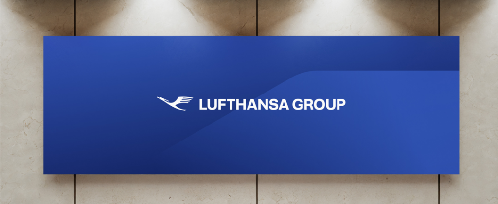
Lufthansa Group’s new brand identity is a subtle but telling shift: less about redesigning airlines, more about finally naming the system behind them. By elevating the crane as a Group-level symbol and rolling out a clear “Member of Lufthansa Group” endorsement, the company is addressing a long-standing gap between how integrated it operates and how fragmented it has appeared to passengers.
The move stops short of full unification, and that restraint is deliberate. Individual airlines keep their identities; the Group claims visibility, not uniformity. For frequent flyers, it offers clarity rather than promises. A recognition of scale and affiliation without implying identical experiences.
Key points
- The crane becomes a Group symbol, separate from Lufthansa Airlines
- “Member of Lufthansa Group” formalizes portfolio unity
- Brand visibility expands across aircraft, lounges, and airports
A good brand strategy doesn’t always standardise the product; it clarifies the structure. Lufthansa Group shows that in complex portfolios, signalling coherence can be more credible than forcing sameness.