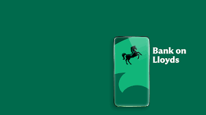
Lloyds launched what it called a “bold creative reset” with a new platform centred on a simple, confident idea: “Bank on Lloyds.” The thinking? In every category, there’s a verb that dominates. You chat on WhatsApp, you meet on Teams, you shop on Amazon, and you bank on Lloyds. CMO Suresh Balaji worked with Wolff Olins on a full identity overhaul (including a custom typeface, a motion-led animated black horse, and a new design system), then with Publicis Go on a campaign voiced by Ewan McGregor. By February, current account searches for Lloyds were at their highest in five years.
- Strategy built on two principles: capability (scale, safety, expertise) and possibility (the breadth of products)
- A completely new design system, Wolff Olins-built, including a custom typeface inspired by early 20th century British letterforms
- Rolled out across Piccadilly Lights, IMAX, BVOD, broadcast, and social — deliberately activating in January when few brands do
- Balaji’s quote that stuck: “I don’t want to sell products to customers. I want to meet their needs.”
The most powerful brand positions feel inevitable once someone says them out loud. “Bank on Lloyds” works because it steals a verb — and verbs are harder to copy than taglines. When you can make your brand name part of the language people already use, you’ve won something competitors can’t easily take back.