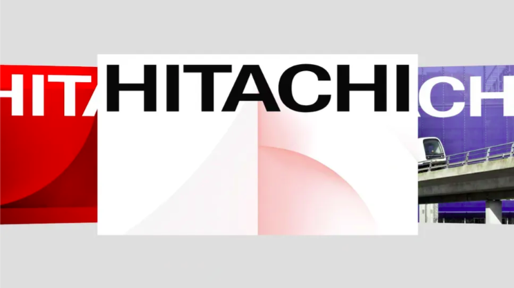
Hitachi’s first visual revamp in 25 years is more than cosmetic—it’s a strategic move to unify its vast global businesses under the banner of “True One Hitachi.” With an evolved wordmark, dynamic graphics, and a custom typeface, the brand signals a future-focused shift while staying rooted in its legacy.
This redesign isn’t about chasing trends—it’s about clarity. By aligning its identity across all sectors, Hitachi strengthens its presence as a digitally driven, singular force in innovation.
Key Takeaways:
- “True One Hitachi” reinforces unity across all divisions.
- First major visual refresh in 25 years, blending heritage with digital readiness.
- Custom typeface Hitachi Sans drives consistency and recognition.
Great rebrands don’t just modernize—they unify. Hitachi proves that cohesion across brand touchpoints is essential when evolving a legacy into a digitally led future.


