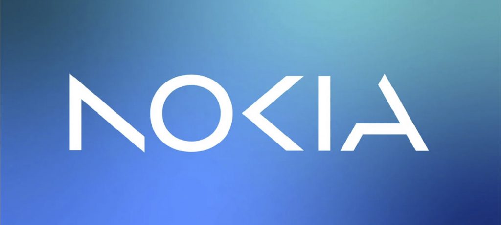
Nokia has completed a rebranding process with a new visual identity and logo. The updated design features a new typeface and a refreshed colour palette that aims to convey a sense of optimism and emphasise that the company is different in so much as it is no longer in the handset business.
The rebranding process was led by branding agency Lippincott, which worked closely with Nokia to develop a visual identity that reflects the company’s future goals.
Nokia’s new logo features a custom typeface that looks modern and forward-thinking, indicating its commitment to innovation. The logo also includes a new wave symbol that represents the company’s focus on digital transformation and innovation in the telecommunications industry.
Nokia’s new branding, compared to Kia’s confusing rebrand, has sparked questions about its legibility and brand recognition during a crucial time. Curiously, the ‘old’ Nokia brand is still in use via a licensee who has acquired the right to use the Nokia brand on handsets.