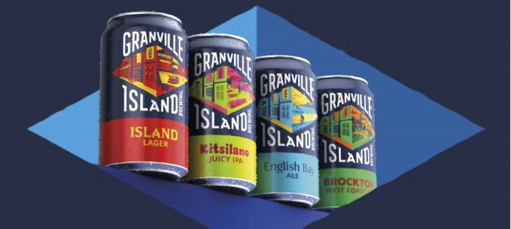
Granville Island Brewing’s new bespoke typeface and illustrations work around an enhanced diamond shape to reflect their west-coast Canadian lifestyle.
Its new look retains the diamond icon the brewery has had since its inception in 1984 but spins a more modern portrait of the 38-year-old craft brewery.
Each brew also has its own individual typography, which is meant to relate back to the location and the style of the brew.
Though each beer has its own colour palette and typography, all are marketed and distributed under the umbrella of the parent brand.