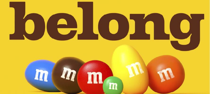
M&Ms updated their identity in an attempt to create a ‘world where everyone feels they belong’.
The new look is centred on the logo’s ampersand (a symbol of how the brand can unite people), features an updated colour palette and their first custom typeface which mixes weights and widths to evoke a sense of fun.
Together with the refreshed look given to their mascots, the new identity will be rolled out across product, retail environments, brand activations and campaigns.
The purpose-driven rebrand has been criticised for lacking a believable and actionable high ground. The company has also been criticised of devising a brand purpose that is purely social and disjointed from their products and business.